Enrich 🌱
A 10‐week human‐centered design spring in which our small team of four designed an prototype app from scratch to help therapists.
Challenge
Design and app following a human‐centered design process for an unknown user group and an unknown problem.
Outcome
Personas, journey maps, storyboards, wireframes, paper prototypes, and hi‐fi mockups. Bam!
Introduction
Enrich is centered around the user’s mental health and well-being. As this daily challenge is often a neglected feature of therapists’ lives, our aim was to inform, incentivize, and encourage healthy practices through our self‐care app. Enrich allows therapists to input their mood, feelings, notes, and other information quickly and efficiently. This streamlines the process of data collection to then create helpful recommendations.
To start the project, we ideated on design questions until we found one that seemed interesting to explore. We then refined our design question into the following:
How might we help therapists actively pursue self‐care?
Research
Our research involved conducting interviews and performing competitive analyses. Each member of our team was tasked to interview a therapist, and some group members were able to interview more than one. This gave us a broader view of the user group.
The interviews provided us with several insights. The following were deemed as most significant:
- Therapists are motivated by growth, but sometimes it is hard to see.
- A goal is to create a resource that patients can use so they know for what, and when, they should seek help.
- People need to partake in different types of self‐care, as different strategies relieve stress in different areas of life.
- Mental health counselors need a way to communicate securely with their clients, one that is flexible in how many people can join the conversation or be involved.
- Mental health counselors encounter a variety of situations which may change how they interact with technology, especially due to client wishes.
- There is no great platform for client outreach or personal therapist marketing.
- Therapist relations and networking is important to build good‐fitting clientele through referrals.
- Reminders regarding agenda, self‐care practices, and more are appreciated.
The competitive analysis influenced both how and how not to design our project; through the analyses we learned that we knew we did not want all of the self‐care activities involve the user being glued to their device. Instead, we wanted to create something to help the user engage with their surroundings and disengage, at least temporarily, from the stress they may be inundated with. After meeting with our different experienced users, our group gathered a great deal of findings from the User Quotes. Read below to see a couple highlights from our interviews.
What motivates me is the opportunity that I can create for children growing up in this age with so much going on in our society.
Child therapist
Personas & User Journey
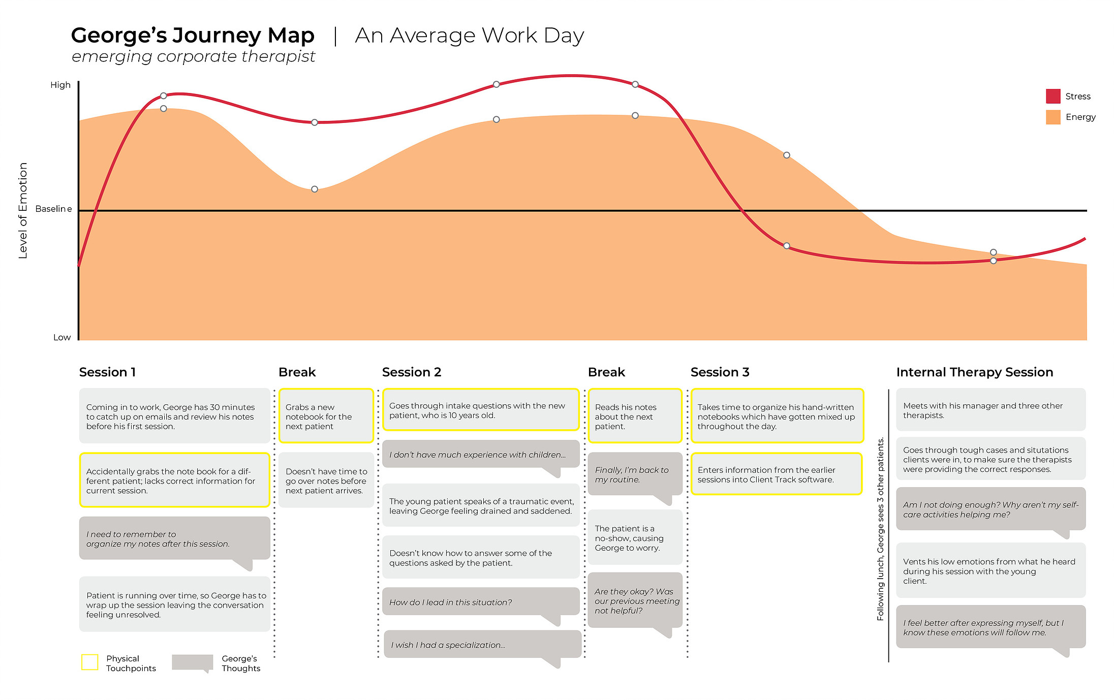
The personas are examples of possible users that allow us to relate our work to actual people and consider how our design decisions would impact their lives.
We created a user journey map as a visual representation of our user’s emotional journey during their work day. In order to cover different cases, we had the journey map show three possible patient experiences a user might encounter, and how the user feels about it. These three patient possibilities included a well known patient, a new patient, and a “no-show” where the patient did not go to the session.
Design Requirements
These design requirements guided our decision‐making process throughout the project and were condensed from research, personas, and journey maps.
- Allow users to control their priorities
- Promote efficient note‐taking during patient sessions
- Empower users to find time for self‐care
- Tailor self‐care to individual users’ needsEffective yet subtle reminders to encourage users
- Allow for networking and sharing of ideasVisualize growth in a rewarding way
- Empower users to self‐analyze and reflect on their self
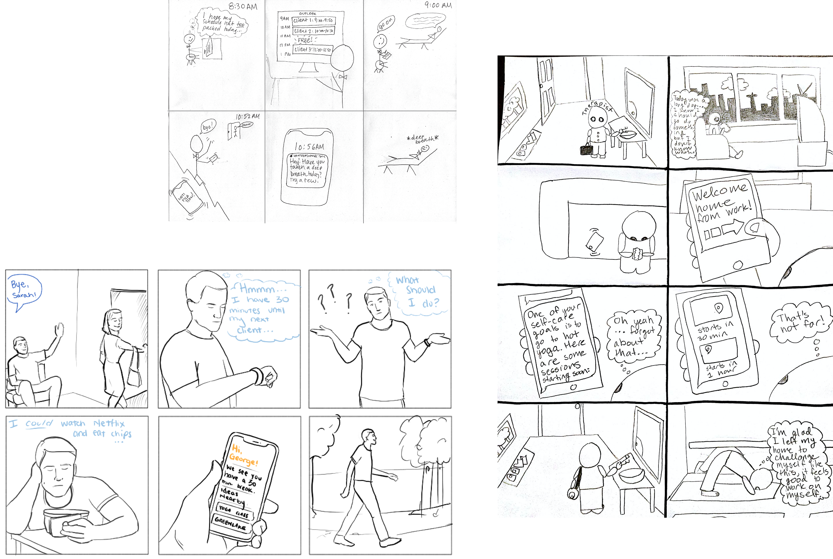
Storyboards
From these requirements, we individually came up with storyboards. which were used in determining the flow of app features.
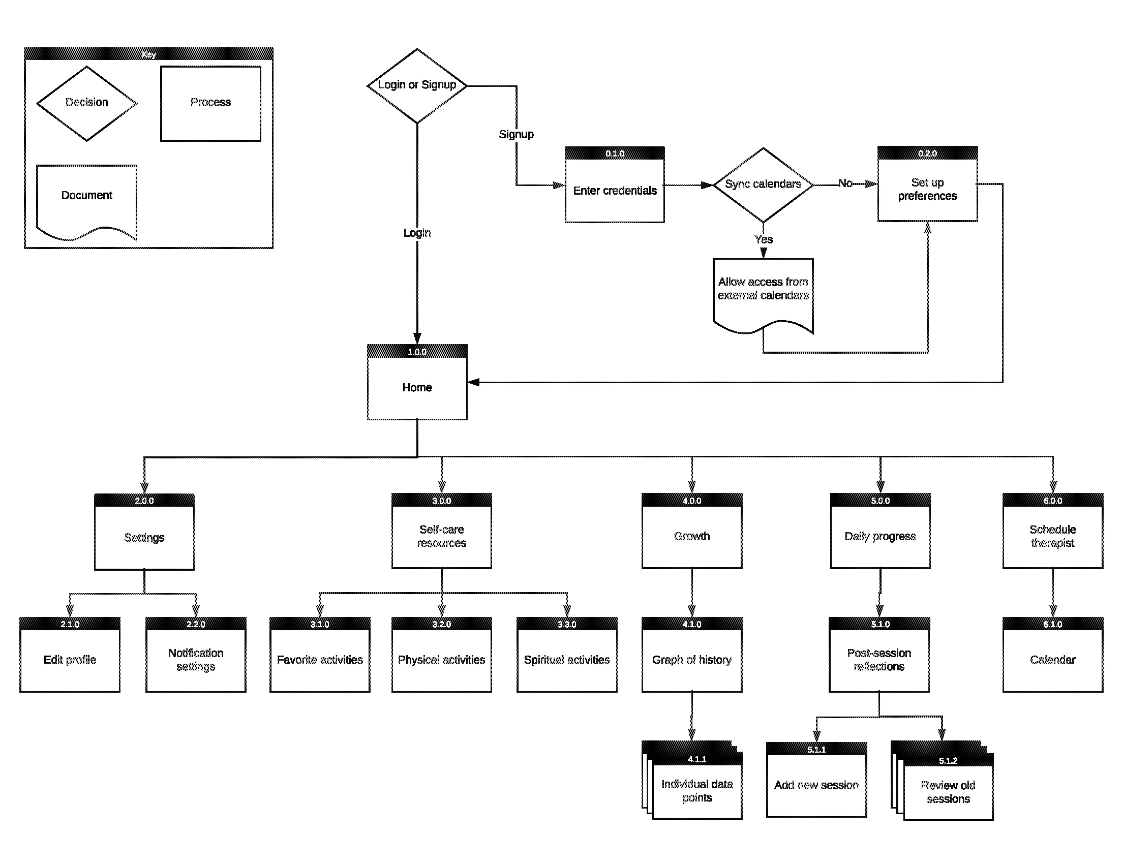
Information Architecture
Creating the information architecture solidified the key paths a user could follow with our app, which included finding a self‐care activity, creating a community, learning about their self care, and visualizing their growth. We began designing these processes through storyboarding, and were able to test them using paper prototypes.
Paper Prototype
The paper prototype was a way for us to perform usability testing on our application’s three key path scenarios. The low‐fidelity interfaces were useful beacuse they allowed us to see how a user would navigate the app and they were easy to alter from the feedback.
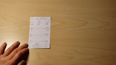
We found that some of the interfaces were not user‐friendly, that the placement of some features did not promote a natural process for users, and that some icons were ambiguous. Additionally, the “Education” aspect of our app proved difficult to find. Therefore, we decided to make another page solely dedicated to education.
Annotated Wireframe
We designed a low‐fidelity interface for each screen of our planned application and annotated the interactive features on each screen. These designs were finalized by our evaluation findings from the paper prototypes and acted as a rough draft for our high‐fidelity mockups.
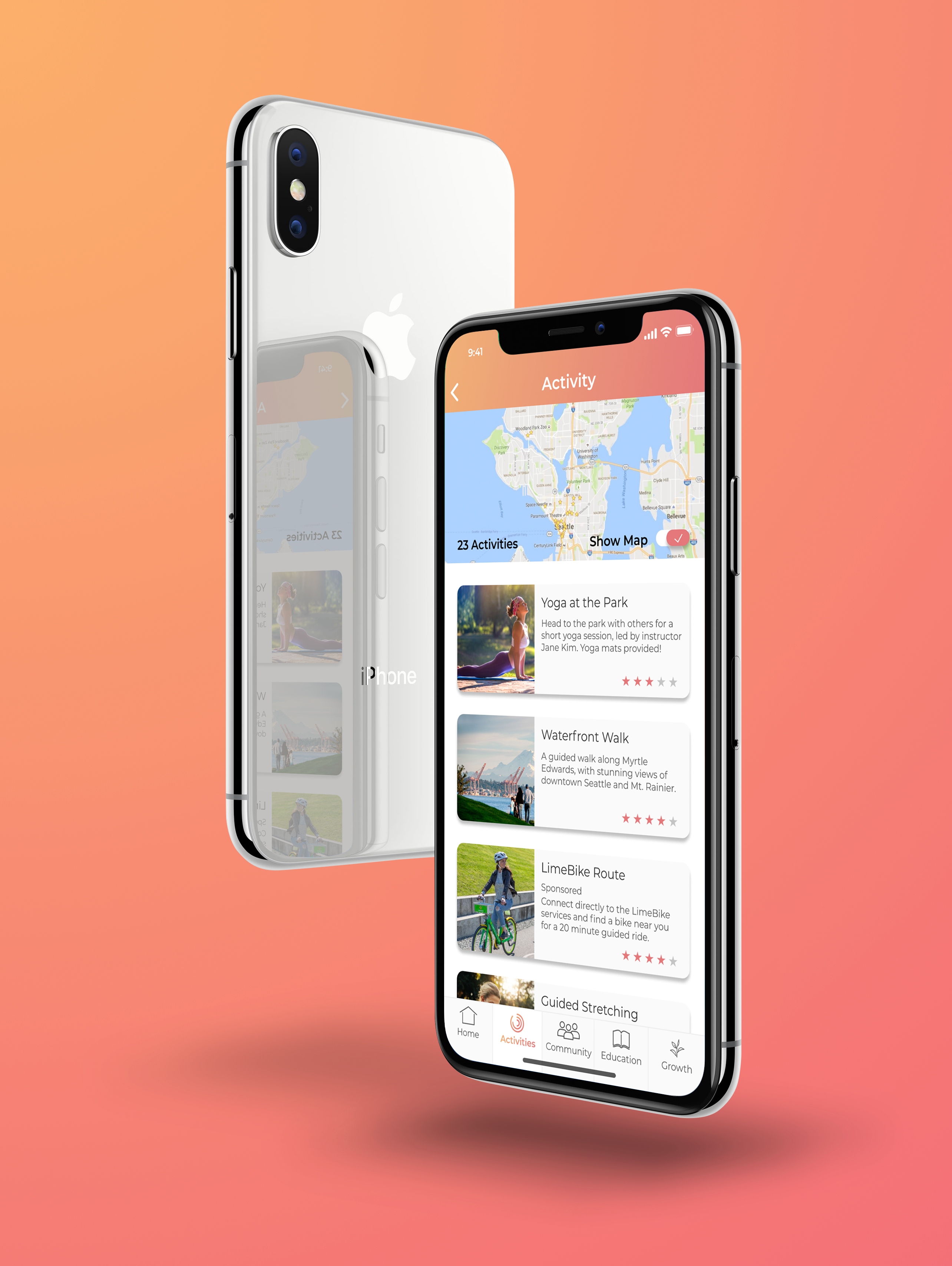
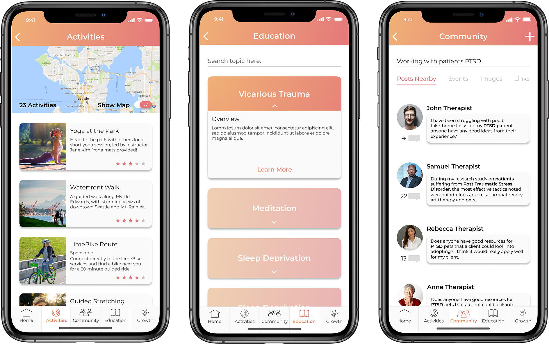
Final Product
These high‐fidelity mockups are a finalized take on what some pages of our app would look like. They were designed based off of our wireframes and provide us with the opportunity to explore what our application would actually look like. We took this opportunity to choose a calming color scheme and work out some design details, such as image overlays, icon gradients, and balancing depth of interactive elements.
Thank you!
Thank you for taking the time to explore this project. If you’re interested, explore some more!